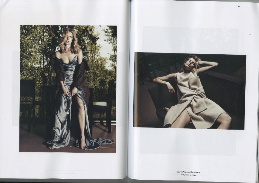
CR Fashion Book

CR Fashion Book is a bi-annual magazine with a different theme each month, each book is about 200 pages long which is published on heavy matte paper stock. The debut issue of CR magazine was in september 2012 which sold out with 50,000 copies just after two months of hitting the news stands, aimed at anyone who loves fashion.
CR Fashion Book features pages an pages of stunning photography, showing off the work of some of the world's leading fashion designers in gloriously rich detail and colour, as well has emerging talents.
It also features short articles related to fashion, style and more. Along side every photo-shoot are the details of who designed the clothes and where you can get them.
Carine Roitfeld is creating something new, something different. New ways to be irreverent with shoots which will be
"not necessarily safer, but different."
Price of magazine £17.15 bi-annually.
AnOther

AnOther magazine is a blend of high fashion and world class photography with features on arts, politics, and literature which makes each beautifully crafted edition a collectors item.
This magazine is published bi-annually and has established a reputation for highly original content.
Price of magazine £6.95 bi-annually.
Price of magazine £6.95 bi-annually.
AnOther Layouts


All off these layouts below have been picked out from AnOther magazine. I really like the way these pages have been laid out, the white space and different sized boxes makes them very effective and interesting to look at. On the lefthand page on the layout below has some text that is written sideways, this is an interesting way of writing something as it means you have to turn the page in able to read it.
Text layout and typography is something I will be experimenting with, the boxes and white space is defiantly something that will feature throughout my magazine where relevant.

Each of these layouts appeal to me because of the use of white space and columns. I like the simpleness of the layouts and the boxes used for images.
Wonderland.

"We're about inspiring, rather than dictating to our readers."
Wonderland is an international, independently published magazine offering unique perspective on the best new and established talent across all popular culture fashion, film, music and art. Wonderland entertains, challenges and informs both men and woman with editorials and fashion shots working with photographers that are most in demand. Aiming to represent the positive and the playful elements of the fashion industry.
Price of magazine £5 per month
Wonderland. Layouts
These two spreads are from Wonderland magazine the fashion issue. What I like about these is they have used black and white photographs and they work really well, I think they show the rawness and emotion in a more intense way than colour does. The layout of the images in these spreads are beautifully done with no fuss just the images there for you to look at.


Dazed & Confused

Dazed & Confused is a British style magazine that is published monthly, it focuses more on music, photography, film, art, literature and fashion.
This magazine started off as a black and white folded poster published sporadically, then soon turned full colour.
Dazed is a magazine promoting the industry, there images are very photographic which attracts audiences straight away. Their main target audience are the young generation, aged between the mid-teens to the early thirty's, targeting people who are interested in fashion and art.
With Dazed & Confused I like how they use white space and the typography stands out and automatically you are aware of the message they are putting across, the reader doesn't have to work to understand, they also change their master head colour every week.
Price of magazine £3.95 per month.
Price of magazine £3.95 per month.
I-D

I-D is a British lifestyle magazine which prides itself on highly sophisticated editorial content and photography, known for its photography and typography.
I-D is mainly based around fashion aimed at the young professional, this magazine also covers music, film, and other upmarket features.
Price of magazine £3.80 per month.
Price of magazine £3.80 per month.
Harpers Bizaar

Harper's Bizaar is a high fashion magazine targeting woman aged between 18-30 years old, the style concious woman.
The magazine pages are tailored specifically for a younger audience through colourful spreads and the use of 20 something models, and the cover story is often based on young successful woman. It hold a strong focus on image appeal and keeps the majority of it's written pieces short.
Most of the magazine is devoted strictly to the ideaology of success and happiness behind high fashion, with the organization of the pages making the aesthetic appeal.
Price of magazine £4.20 per month.
Price of magazine £4.20 per month.
Vogue

Vogue is a fashion and lifestyle magazine and is the world's most influential fashion magazine reaching 11 million readers in the US and 12.5 million internationally.
The audience of Vogue readers are woman in their late twenty's to early thirty's who work in fashion or have a desire to work in fashion or simply enjoy reading about it. They target more upmarket woman as they would have to be in a more well paid job in order to afford it. Vogue write about: Fashion, Hair & Beauty, Popular Culture, Entertainment, health & Exercise.
- Average age 31 years old
- 70% of readers read no other magazine other than vogue
- 71% of female readers spend holiday's abroad
- 98.5% of female readers make use of advice and recommendations given by vogue
Price of magazine £4.10 per month.
Vogue Sensational Summer Layouts
Below is a series of photographs from Vogue magazine's sensational summer shoot.
I really like the use of white space and the cut off corner on the righthand page, they have used a different layout to display each photo throughout which makes it very effective and exciting to see the next image.

The photograph below is one that I love, the whole look of the image works really well being in black and white.

Vogue Black & White Layouts

I love the simplicity of this layout and how the photograph stands out its the first thing you get drawn too, the words on the opposite page are non readable from just a glance so it makes you have to look a little closer to see what it says, it brings the reader in and you have their attention. The white space and black and white compositions inspire me with my own layout ideas.

This layout from Vogue is intriguing because of the repeated shapes on both pages, the layout emphasises the shape of the models body ob the lefthand page, with the text box flaring out like the dress movement on the opposite page, its almost mirroring the photograph with the layout on the left. This strategy for layout has been very much taken from the consideration of the model, the graphic designer has emphasised this in a dramatic and effective way. I like the blank space and simplicity of this layout along with the black and white colour scheme.
Elle

Elle is a worldwide lifestyle magazine that focuses on fashion, beauty, health, and entertainment, reaching over 21 million readers. Their target audience is specifically aimed at young woman age between 16-30 years old who are interested in the latest fashion and beauty trends.
The advertisements that feature within this magazine are generally fashion and beauty brands advertising their latest products or fashion lines aimed at females, so the reader would have to be earning money with disposable income to purchase any of the products.
Elle represent woman as in-depended and strong figures for their readers.
Price of magazine £3.60 per month.
Elle Layouts
These are selected pages I like the layouts of from Elle magazine. The two pages in the middle which are from some articles I like the format of the columns, how they start from different places down the page and also the big lettering of the first letter of the first word, and again the use of white space.
The two page at either end I found interesting with the use of boxes and how they have been laid out on the page, one has boxes arranged in the middle whilst the other has them separated around the page, both have used different sized boxes, I find this layout interesting and one I will experiment with.

No comments:
Post a Comment